I recently made the decision to purchase a MacBook Pro and with that comes Mac OS X. As a long-term Windows user that still is quite the change. I'm one of the people who never close applications and thus have tons of windows open. In Windows 7 or later this did not cause any problems since all windows are minimized in their app icon.
In Mac OS X, however, they end up on the right side of the dock. With my previous behavior, the dock often looked like this:

It's hard to adjust to a completely different operating system and these tiny icons were hard to operate with, especially on a 13" screen. Hopefully, such little things should be configurable for an easier switch, right?
The Solution
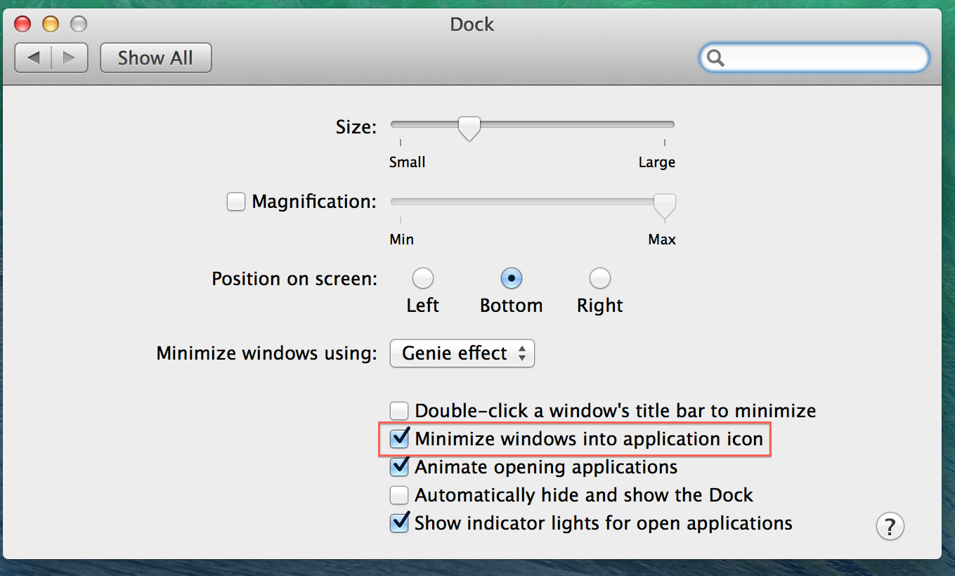
A Google search brought me to the article on Macworld, which offers a solution to the mentioned problem (besides other helpful tips). If you feel the same and want to change the dock's behavior as well, do the following:
System Settings -> Dock -> Activate the "Mimize windows into application icon" option

The Result
The result is a much cleaner dock, at least for my usage pattern:
