Last week, we've continued the Android Quick Tips series with how to dynamically tint Android actionbar menu items. This week, we'll expand on the topic of actionbar menu items and show you how to add padding to single menu items.
Feel free to browse our previous Android Quick Tips:
Android Quick Tips #1 Series Overview
- TextView
- Android Studio Productivity
- Gradle
- Debugging
- Screen Capturing
- Android Studio
- Intents
- How to Dynamically Tint Actionbar Menu Icons
- How to Add Padding to Actionbar Menu Icons
How to Add Padding to Actionbar Menu Items
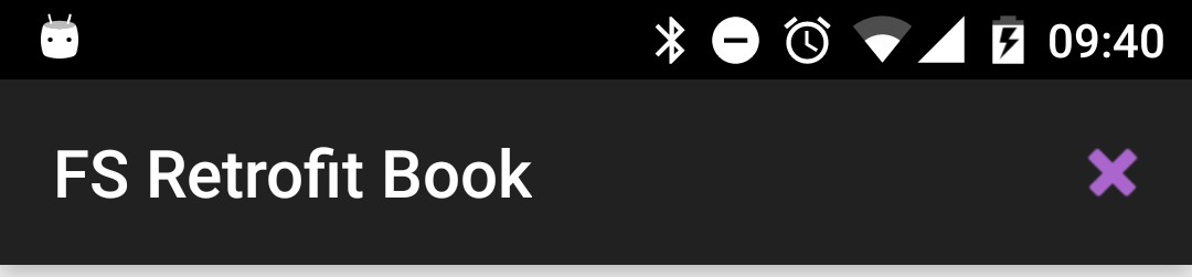
In the previous Android Quick Tips post, we've looked at a simple actionbar with one item:

We're setting the icon of the menu item in the menu resource file:
<menu xmlns:android="http://schemas.android.com/apk/res/android"
      xmlns:app="http://schemas.android.com/apk/res-auto"
      xmlns:tools="http://schemas.android.com/tools"
      tools:context=".MainActivity">

    <item
        android:id="@+id/action_delete"
        android:icon="@android:drawable/ic_delete"
        android:title="Delete"
        app:showAsAction="ifRoom"/>

</menu>
However, let's assume our designer doesn't like how large the icon is in the actionbar. He wants it smaller. Of course, you could request the same drawable again, just in a smaller resolution to solve the case. While technically it'd achieve the result, we don't recommend using this technique. It's hard to predict how this looks on the variety of the devices out there and can easily make the icon look pixely.
Better is to use the same high-resolution icon, but to add padding to it. Unfortenately, Android doesn't support this directly in the menu item declaration.
What you've to do is to create a new XML drawable, for example /drawable/delete_with_padding.xml:
<?xml version="1.0" encoding="utf-8"?>
<layer-list xmlns:android="http://schemas.android.com/apk/res/android">
    <item
        android:bottom="4dp"
        android:left="4dp"
        android:right="4dp"
        android:top="4dp">

        <bitmap android:src="@android:drawable/ic_delete"/>

    </item>
</layer-list>
This XML drawable will have four padding items, one for each side, and the lastly a bitmap to the icon we've used in the original menu item declaration. Obviously, you can adjust the 4dp padding values on each side for your needs. The last step is to use this new /drawable/delete_with_padding.xml as your actionbar menu item icon:
<menu xmlns:android="http://schemas.android.com/apk/res/android"
      xmlns:app="http://schemas.android.com/apk/res-auto"
      xmlns:tools="http://schemas.android.com/tools"
      tools:context=".MainActivity">

    <item
        android:id="@+id/action_delete"
        android:icon="@drawable/delete_with_padding"
        android:title="Delete"
        app:showAsAction="ifRoom"/>

</menu>
Menu Item: 4dp Padding
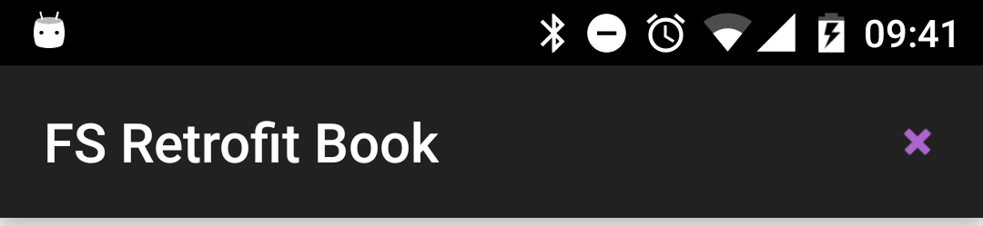
Menu Item: 8dp Padding
This approach will allow you to add padding to your actionbar menu item icons without touching the actual icons!
We hope this was helpful to you! Feel free to share the blog post and let us know any questions in the comments.