An informative plot does not only present the data itself well, but annotates the content in a way that readers will quickly grasp it. One critical element is to always add accurate axis labels. In this tutorial, you'll learn how to add and configure axis labels in matplotlib plots.
Matplotlib Series Overview
Always Add Axis Labels!
In a previous tutorial on simple line plots, you've learned how to create line plots with multiple lines that are even in custom colors. For example, you should be able to set up the following graph:
# data
year = [2014, 2015, 2016, 2017, 2018, 2019]
tutorial_public = [39, 117, 98, 54, 28, 15]
tutorial_premium = [0, 0, 13, 56, 39, 14]

# plot
plt.plot(year, tutorial_public, color="#6c3376", linewidth=3)
plt.plot(year, tutorial_premium, color="#f3e151", linewidth=3)
plt.show()
This results in a decently good looking plot:
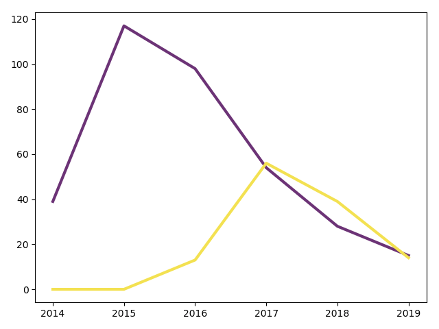
However, a reader has to guess what data is being displayed. The x-axis looks like years, but what is the y-axis? You could explain it in a text or caption below, but in general you should always add axis labels to make it as easy as possible.
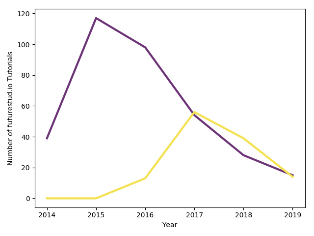
Therefore, you usually added them in previous tutorials by calling plt.xlabel() and plt.ylabel():
plt.plot(year, tutorial_public, color="#6c3376", linewidth=3)
plt.plot(year, tutorial_premium, color="#f3e151", linewidth=3)

# add axis labels
+plt.xlabel('Year')
+plt.ylabel('Number of futurestud.io Tutorials')

plt.show()
These two lines are all you have to do to create a more straightforward plot:
Customize Label Design
As always, matplotlib also provides a variety of customization options. You don't like the default look of the axis labels? No problem, you can change them to your liking.
In order to customize the design, you can pass additional parameters to the xlabel() and ylabel() calls. You can pass any of the matplotlib's text options.
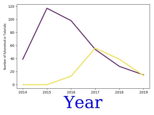
For example, if you think the year is the critical part of this plot, make it stand out with blue text color, serif font, and a large text size:
plt.plot(year, tutorial_public, color="#6c3376", linewidth=3)
plt.plot(year, tutorial_premium, color="#f3e151", linewidth=3)

+plt.xlabel('Year', color='blue', family='serif', fontsize=50)
+plt.ylabel('Number of futurestud.io Tutorials', fontsize='small')

plt.show()
All these parameters are optional. Note that you can pass a fontsize in points or one of the pre-defined sizes (xx-small, x-small, small, medium, large, x-large, xx-large).
Whether this is still a pretty graph is debatable, but you can see the effect of the additional parameters:
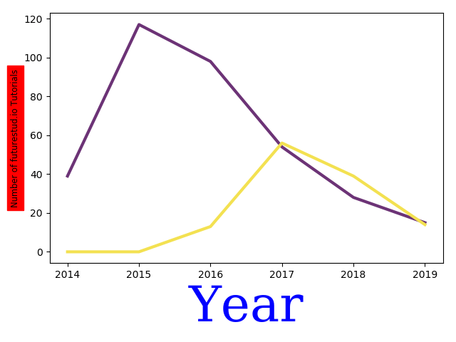
One final option you should know about is the background parameter:
plt.plot(year, tutorial_public, color="#6c3376", linewidth=3)
plt.plot(year, tutorial_premium, color="#f3e151", linewidth=3)

plt.xlabel('Year', color='blue', family='serif', fontsize=50)
# set background color
+plt.ylabel('Number of futurestud.io Tutorials', backgroundcolor='red', fontsize='small')

plt.show()
Summary
In this tutorial, you have learned how to add and customize plot labels with matplotlib. It's a necessary step to create insightful plots. However, even perfect labels are not enough. If you look at the above plot, without further information, you don't know what the purple and yellow line stands for. Thus, you'll learn to add legends in the next tutorial. Stay tuned!
All code is also available for easy copy & paste on a GitHub repository.
Do you have questions or feedback where this series should go? Let us know on Twitter @futurestud_io or leave a comment below.
Enjoy plotting & make it rock!https://github.com/futurestudio/matplotlib-tutorials)
Mentioned Resources
- Simple line plots Tutorial
- matplotlib documentation: text options
- GitHub repository of matplotlib tutorials