After learning about simple bar plots in the previous tutorial, it's time to take a look at stacked bar plots. Stacked bar plots provide more detail information about every individual bar. Let's dive in!
Matplotlib Series Overview
Stacked Bar Plots
In the simple bar plot tutorial, you used the number of tutorials we have published on Future Studio each year. But there was no differentiation between public and 🌟 premium tutorials. With stacked bar plots, we can still show the number of tutorials are published each year on Future Studio, but now also showing how many of them are public or premium.
Here's the data you can use in this tutorial:
import matplotlib.pyplot as plt

year = [2014, 2015, 2016, 2017, 2018, 2019]
tutorial_public =  [39, 117, 98, 54, 28, 15]
tutorial_premium = [ 0,   0, 13, 56, 39, 14]
As you can see from the number, we shifted from mainly public tutorials in 2014 to 2016 to a more balanced publishing in the last few years.
So let's take a look at how you can create stacked bar plots. In the last tutorial, you learned that you can combine different styles of bar plots by calling the bar() method multiple times. You create stacked bar plots the same way, the first bar() call will be the amount of public tutorials with the standard options, but need to tweak the second method call to plot the premium tutorials.
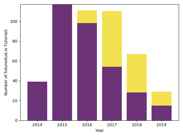
When you call bar() a second time to create new bar plots above the already existing ones, you specify that they don't start at 0, but at the value of the public tutorials of that year with the bottom parameter. To make the plot prettier, we change the color as well with the color parameter.
# the first call is as usual
plt.bar(year, tutorial_public, color="#6c3376")

# the second one is special to create stacked bar plots
plt.bar(year, tutorial_premium, bottom=tutorial_public, color="#f3e151")

plt.xlabel('Year')
plt.ylabel('Number of futurestud.io Tutorials')

plt.show()
With only a handful of lines of code, you created your first nice stacked bar plot:
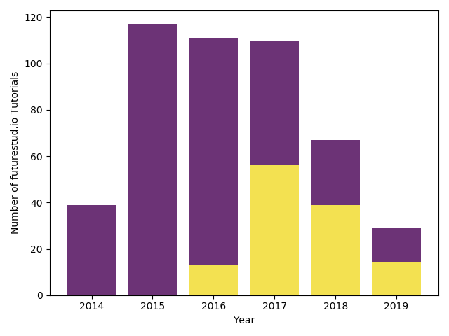
As you probably already realized, you have fine control over which bar will be on top. Let's switch them.
Stack Bar Plot (Switched)
In recent years, the premium tutorials have been the base of Future Studio. Maybe they should be at the bottom while public tutorials are just a bonus on top?
You can simply create such a plot by changing which data you pass to each call.
year = [2014, 2015, 2016, 2017, 2018, 2019]
tutorial_public = [39, 117, 98, 54, 28, 15]
tutorial_premium = [0, 0, 13, 56, 39, 14]

plt.bar(year, tutorial_premium, color="#f3e151")
plt.bar(year, tutorial_public, bottom=tutorial_premium, color="#6c3376")

plt.xlabel('Year')
plt.ylabel('Number of futurestud.io Tutorials')

plt.show()
This results in a similar plot, just with the public and premium tutorials switched:
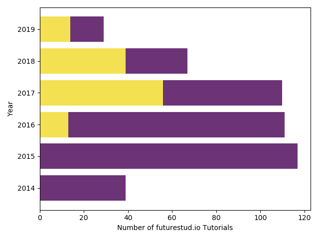
Horizontal Stacked Bar Plots
You still have the same customization options you have learned in the previous tutorials (for example, edgecolor). In this last example, you will create a horizontal stacked bar plot.
If you want to create horizontal instead of the default vertical plots, you need to call barh() instead of bar(). For stacked bar plots, you need to make one further change. The bottom parameter changes to the left parameter, which makes sense if you visualize the plot, but something to pay attention to when changing to a horizontal plot.
year = [2014, 2015, 2016, 2017, 2018, 2019]
tutorial_public = [39, 117, 98, 54, 28, 15]
tutorial_premium = [0, 0, 13, 56, 39, 14]

plt.barh(year, tutorial_premium, color="#f3e151")
# careful: notice "bottom" parameter became "left"
plt.barh(year, tutorial_public, left=tutorial_premium, color="#6c3376")

# we also need to switch the labels
plt.xlabel('Number of futurestud.io Tutorials')
plt.ylabel('Year')

plt.show()
Don't forget to also switch the labels!
This will result in a pretty horizontal stacked bar plot:
Summary
In this tutorial, you have learned the basics of creating stacked bar plots. Pay attention to passing the correct values to the bottom or left parameters to create correct plots!
All code is also available for easy copy & paste on a GitHub repository.
Do you have questions or feedback where this series should go? Let us know on Twitter @futurestud_io or leave a comment below.
Enjoy plotting & make it rock!
Mentioned Resources
- Simple bar plot tutorial on Future Studio
- GitHub repository with all code samples