In the first two tutorials in this series, you've learned to create scatter and line plots with matplotlib. In this tutorial, you'll learn more about bar plots, including how to create and theme them.
Matplotlib Series Overview
Bar Plots
As in the past tutorials, before you can create pretty graphs, you need to import the library and obtain some data. Let's use the number of tutorials we have published on Future Studio over the years:
import matplotlib.pyplot as plt

year = [2014, 2015, 2016, 2017, 2018, 2019]
tutorial_count = [39, 117, 111, 110, 67, 29]
Next, let's pass the data to matplotlib for a bar plot. To create a bar plot, simply use the bar() method:
plt.bar(year, tutorial_count)

plt.xlabel('Year')
plt.ylabel('Number of futurestud.io Tutorials')

plt.show()
Of course, you should always set the axis labels with xlabel() and ylabel() to make it a good graph. This results in a basic bar plot:
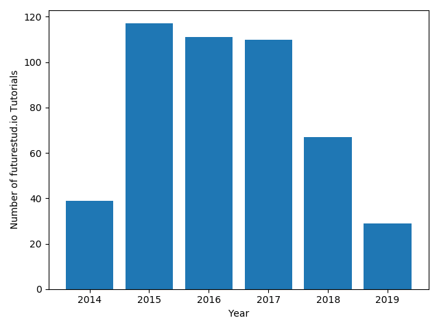
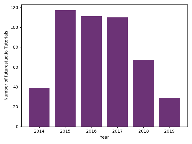
By default, matplotlib uses a blue bars. Let's change that again to be more in line with Future Studio's design.
Bar Plot with Custom Colors
You can change the bar colors by passing the color parameter to the bar() method. You can pass direct hex codes:
year = [2014, 2015, 2016, 2017, 2018, 2019]
tutorial_count = [39, 117, 111, 110, 67, 99]
+plt.bar(year, tutorial_count, color="#6c3376")

plt.xlabel('Year')
plt.ylabel('Number of futurestud.io Tutorials')

plt.show()
This results in a more Future-Studio-styled plot:
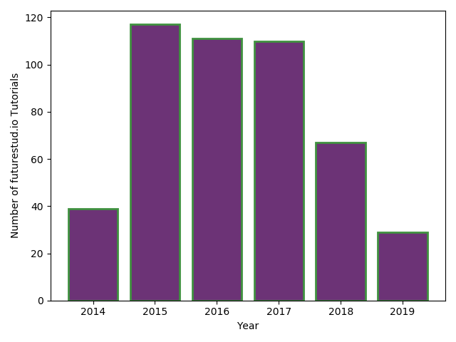
One more customization is to change the edge color of the bar (you can also think of it as the border of the bar). You can pass the edgecolor and linewidth parameters to further refine the design:
year = [2014, 2015, 2016, 2017, 2018, 2019]
tutorial_count = [39, 117, 111, 110, 67, 29]
+plt.bar(year, tutorial_count, color="#6c3376", edgecolor="#409240", linewidth=2)

plt.xlabel('Year')
plt.ylabel('Number of futurestud.io Tutorials')

plt.show()
This results in the same graph as before, but now with green edge colors:
Multiple Plot Calls to Create One Plot
Adding an edge color to all bars may look nice, but doesn't add much to the value of the plot. Instead, it may be more useful to only highlight a subset of bars with an edge color. In our example data, it makes sense to only highlight the current year, as the number of published tutorials for 2019 is not final yet and will further grow. So, let's only add an green edge to that 2019 bar.
There are a few key points to learn here. First, matplotlib allows you to sequentially call plot functions and build one (combined) plot. Therefore, if you want to create a bar plot with five regular bars and one special bar, you call the bar() function twice, once for each style.
Watch out for passing the correct data though. Now you need to pass the data except for the last year to the normal style (with list[:-1], which is the full list without the last element) and just the last year to the cool edge style (with list[-1]). You can find basic list operations with python in this tutorial.
year = [2014, 2015, 2016, 2017, 2018, 2019]
tutorial_count = [39, 117, 111, 110, 67, 29]

+plt.bar(year[:-1], tutorial_count[:-1], color="#6c3376")
+plt.bar(year[-1], tutorial_count[-1], color="#6c3376", edgecolor="#409240", linewidth=2)

plt.xlabel('Year')
plt.ylabel('Number of futurestud.io Tutorials')

plt.show()
Only when you call show(), matplotlib will put everything together and build one plot that contains both styles:
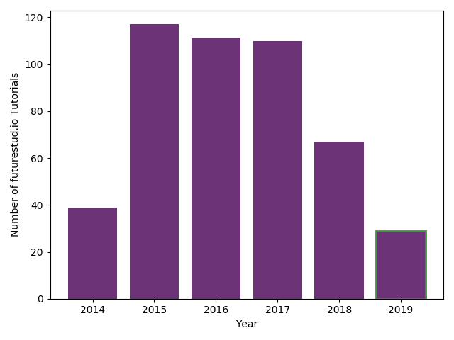
In the plot above, only the last year, 2019, is highlighted with green edges.
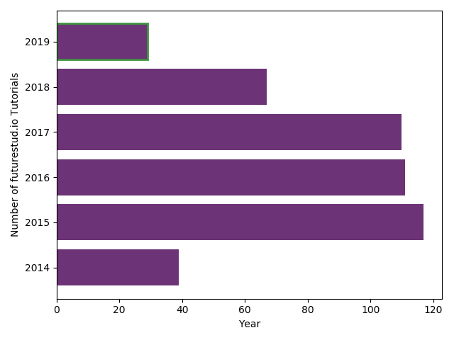
Horizontal Bar Plots
The final option you should learn in this tutorial is that you can easily create horizontal (instead of vertical) bars with barh instead of bar. The options you can pass are the same:
year = [2014, 2015, 2016, 2017, 2018, 2019]
tutorial_count = [39, 117, 111, 110, 67, 29]

+plt.barh(year[:-1], tutorial_count[:-1], color="#6c3376")
+plt.barh(year[-1], tutorial_count[-1], color="#6c3376", edgecolor="#409240", linewidth=2)

plt.xlabel('Year')
plt.ylabel('Number of futurestud.io Tutorials')

plt.show()
This results in a horizontal bar plot:
Summary
In this tutorial, you have learned how to create and customize simple bar plots. In the next tutorial, you will learn more about stacked bar plots.
All code is also available for easy copy & paste on a GitHub repository.
Do you have questions or feedback where this series should go? Let us know on Twitter @futurestud_io or leave a comment below.
Enjoy plotting & make it rock!
Mentioned Resources
- GitHub repository with all code samples