matplotlib ships with a variety of different plots. In this tutorial, you'll get to know line plots or line charts in more detail. You'll see how to create a simple line plot, how to adjust styling, and how to draw multiple lines in a single chart.
Matplotlib Series Overview
Sample Data for Line Plots
After working with rather random data in the matplotlib getting started tutorial, let's start to use some real data. For this and the next few tutorials, you can work with the number of published tutorials on Future Studio by year. We started back in Spring of 2014 with weekly tutorials, then moved to twice weekly for the next three years and reduced to more premium content since 2018. Our tutorials are therefore split in public and premium tutorials. You can take a look at the exact numbers:
import matplotlib.pyplot as plt

year = [2014, 2015, 2016, 2017, 2018, 2019]
tutorial_count = [39, 117, 111, 110, 67, 29]

tutorial_public = [39, 117, 98, 54, 28, 15]
tutorial_premium = [0, 0, 13, 56, 39, 14]
Note that each element in the tutorial_ count arrays matches to the year array's content (e.g., 39 tutorials in 2014).
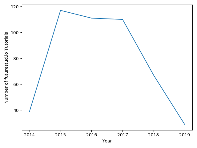
Let's create a line plot with the year and tutorial_count arrays. You should remember from the getting started tutorial how to pass data to matplotlib, create a line plot, and to set the labels.
year = [2014, 2015, 2016, 2017, 2018, 2019]
tutorial_count = [39, 117, 111, 110, 67, 29]
plt.plot(year, tutorial_count)

plt.xlabel('Year')
plt.ylabel('Number of futurestud.io Tutorials')

plt.show()
The result is similar to what you have seen before:
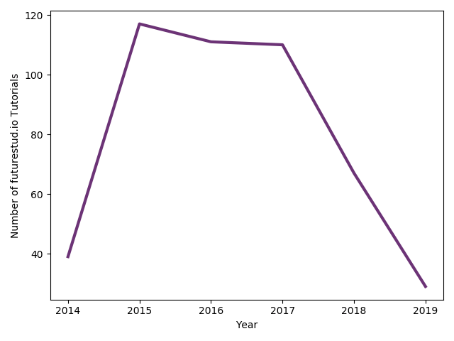
By default, matplotlib uses a skinny blue line. Let's change that to be more in line with Future Studio's design and use more prominent, thicker lines.
Line Plot with Custom Design and Color
Line plots also offer the color parameter. But this time instead of passing a color as text (e.g., red), you pass a #hex value, which is Future Studio's corporate design purple. In addition, you can adjust the width of the line with linewidth:
year = [2014, 2015, 2016, 2017, 2018, 2019]
tutorial_count = [39, 117, 111, 110, 67, 29]
+plt.plot(year, tutorial_count, color="#6c3376", linewidth=3)

plt.xlabel('Year')
plt.ylabel('Number of futurestud.io Tutorials')

plt.show()
With these minor changes, the plot now looks like this:
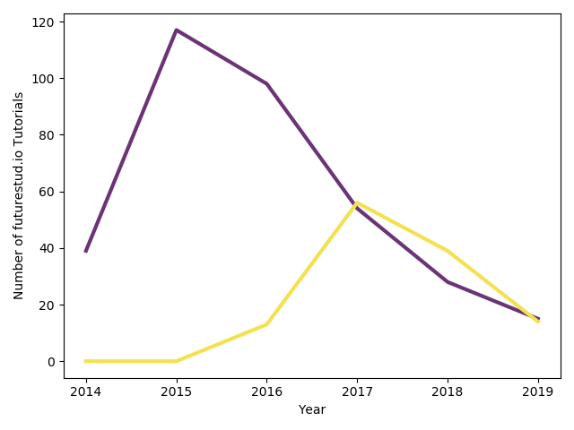
Line Plot with Multiple Lines
Finally, let's draw multiple data lines in a single plot. To do this, you can use the numbers for the public and premium tutorials. You can simply call plt.plot() multiple times in a sequence before calling plt.show() and matplotlib will continue to draw each line onto the same plot. Note that you should pass different colors for each line to create a plot that is easy to understand:
year = [2014, 2015, 2016, 2017, 2018, 2019]
tutorial_public = [39, 117, 98, 54, 28, 15]
tutorial_premium = [0, 0, 13, 56, 39, 14]
+plt.plot(year, tutorial_public, color="#6c3376", linewidth=3)
+plt.plot(year, tutorial_premium, color="#f3e151", linewidth=3)

plt.xlabel('Year')
plt.ylabel('Number of futurestud.io Tutorials')

plt.show()
This results in a line plot with multiple lines and two different colors:
Summary
In this tutorial, you have learned how to create some simple line plots. The principles of matplotlib are pretty consistent. You can adjust individual plots by adjusting options by passing parameters to the function. If you need multiple lines in a single plot, call the appropriate plot function for each data set.
All code is also available for easy copy & paste on a GitHub repository.
In the next tutorial, you will continue on our tour of matplotlib's family of plots and dive into bar plots.
Enjoy plotting & make it rock!
Mentioned Resources
- matplotlib — Getting Started tutorial on Future Studio