matplotlib is a commonly used library to create high-quality plots in Python. matplotlib has vast capabilities, but also a steep learning curve. In this series, you'll be gently guided in small steps through matplotlib's functionality. In each tutorial, you'll be working with one plot and extending or refining it with one particular feature.
Matplotlib Series Overview
- Getting Started with High-Quality Plots in Python
- Simple Line Plots
- Simple Bar Plots
- Stacked Bar Plots
- Save Plots as File
- Customize Labels
- Create Basic Legends
Requirements for matplotlib: Python
If you're new to matplotlib, you need to make sure you have an environment that allows you to execute Python code. We personally installed Python and PyCharm Professional. Once you have Python running, you can install matplotlib via the command line:
python -m pip install -U pip # updates pip package manager
python -m pip install -U matplotlib # installs/updates matplotlib
Getting Started with matplotlib
Let's create our first plot, shall we?
First, you need to import matplotlib and create some random sample data to display in a plot:
import matplotlib.pyplot as plt

x = [0, 1, 2, 3, 4]
y = [0, 1, 4, 9, 16]
Next, let's pass the data to matplotlib for a plain plot. Finally, you want matplotlib to show the result:
x = [0, 1, 2, 3, 4]
y = [0, 1, 4, 9, 16]

+plt.plot(x, y)
+plt.show()
The result of just a couple of code lines is already presentable:
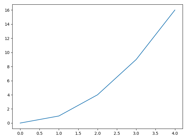
By default, matplotlib uses a blue line. It sets the axis ticks and tick labels automatically. Later in this tutorial, you'll learn how to change them manually.
Scatter Plot with matplotlib
A line plot is not always what you need. Let's look at how easy it is to create a different kind of plot: scatter plots. You can essentially re-use the code from the previous section, but change the plot method to scatter:
# use some different sample data
+x = [0, 1, 2, 5, 8]
+y = [1, 4, 3, 2, 5]

# scatter plot is just calling a different method
+plt.scatter(x, y)
plt.show()
Again, the result already looks decent:
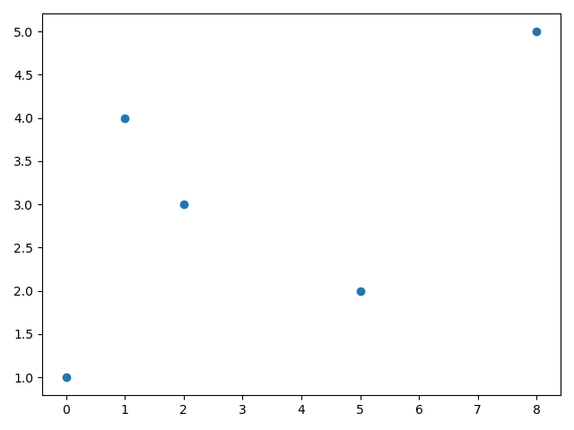
By default, matplotlib uses a light blue as the color. Let's change that!
Custom Scatter Plot Designs
To change the color of a plot content, you can pass an additional argument with the plot or scatter method named color. Let's set it to red:
x = [0, 1, 2, 5, 8]
y = [1, 4, 3, 2, 5]
+plt.scatter(x, y, color='red')
plt.show()
The result is an identical plot as before, just with red instead of blue dots:
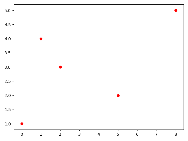
This is one major advantage of matplotlib: you can consistently get the same plot even if you change some options. If you have three plots that are supposed to look the exact same (let's say similar data but other numbers), good luck trying to do that in Excel. matplotlib always delivers the same design. The style stays consistent.
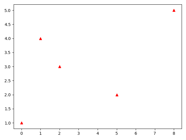
Let's have some fun and change the boring red dots to cool triangles. Again, this is another parameter you can pass to the scatter method. This time it's the marker parameter and to get triangles, simply pass ^:
x = [0, 1, 2, 5, 8]
y = [1, 4, 3, 2, 5]
+plt.scatter(x, y, color='red', marker='^')
plt.show()
Now you have the same plot, but with triangles:
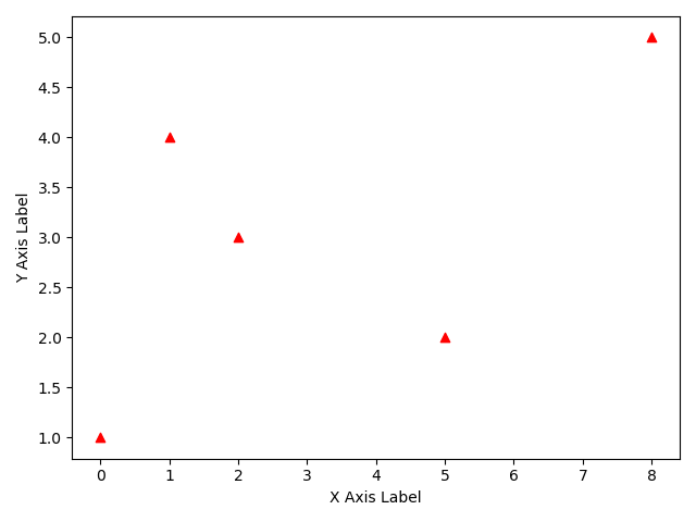
Add Basic Labels with matplotlib
The above plots fail every plot check, as it misses important details: axis labels, legend, units. What data are you looking at? You can manually add labels with the xlabel() and ylabel() methods:
x = [0, 1, 2, 5, 8]
y = [1, 4, 3, 2, 5]
plt.scatter(x, y, color='red', marker='^')
+plt.xlabel('X Axis Label')
+plt.ylabel('Y Axis Label')
plt.show()
Now you have a plot with labels (albeit not very descriptive ones):
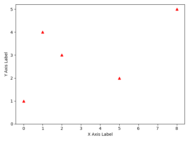
Adjust Axis Units with matplotlib
As you can see in the plots above, matplotlib tries to set the axis units to a sensible span. In our examples, the y-axis starts at 1, which can be misleading. How can you change it to 0?
Easy. Simply call ylim() with a single number and it'll use this as bottom limit:
x = [0, 1, 2, 5, 8]
y = [1, 4, 3, 2, 5]
plt.scatter(x, y, c='red', marker='^')
plt.xlabel('X Axis Label')
plt.ylabel('Y Axis Label')
+plt.ylim(0)
plt.show()
Note that matplotlib adjusts the y axis markers automatically. This results in the final plot for this tutorial:
Summary
In this tutorial, you went through your first few plots with matplotlib. If you want to, you can create good plots with just a few lines. But matplotlib also allows you to access small detail configurations, providing full customization to your plots. Of course, you only have seen a tiny glimpse of the ice berg.
In this series, you'll dive deeper in many features of matplotlib. In the next tutorial, you'll learn more into customizing the axis ticks and labels.
All code is also available for easy copy & paste on a GitHub repository.
Do you have questions or feedback where this series should go? Let us know on Twitter @futurestud_io or leave a comment below.
Enjoy coding & make it rock!
Mentioned Resources
- matplotlib Main website of the matplotlib library
- Python programming language needed for matplotlib
- Our favorite IDE: PyCharm Professional
- GitHub repository with all code in one place